The Clinton School: Whimsical Wayfinding for an International Baccalaureate World School in NYC
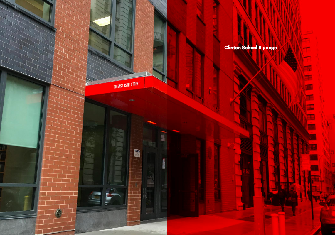
When the Clinton School moved to a new facility near Manhattan’s Union Square, rayogram offered to create a new wayfinding system.
While the school’s gleaming new white hallways and stairwells were sleek and attractively minimalist, they made it difficult to find one’s way—and didn’t reflect the vibrant, diverse Clinton School community. Opting for a whimsical, playful approach, we started out by polling students in each grade to pick the color for their floor (results ranged from bubblegum pink to Tiffany blue).
Next, we identified needs for signage that would not compete with mandated signs (eg: emergency exits); clearly indicate to students exactly which floor or classroom they were about to enter; communicate that students and teachers were in an environment for burgeoning artists and writers by bringing a sense of respectful play to the halls.
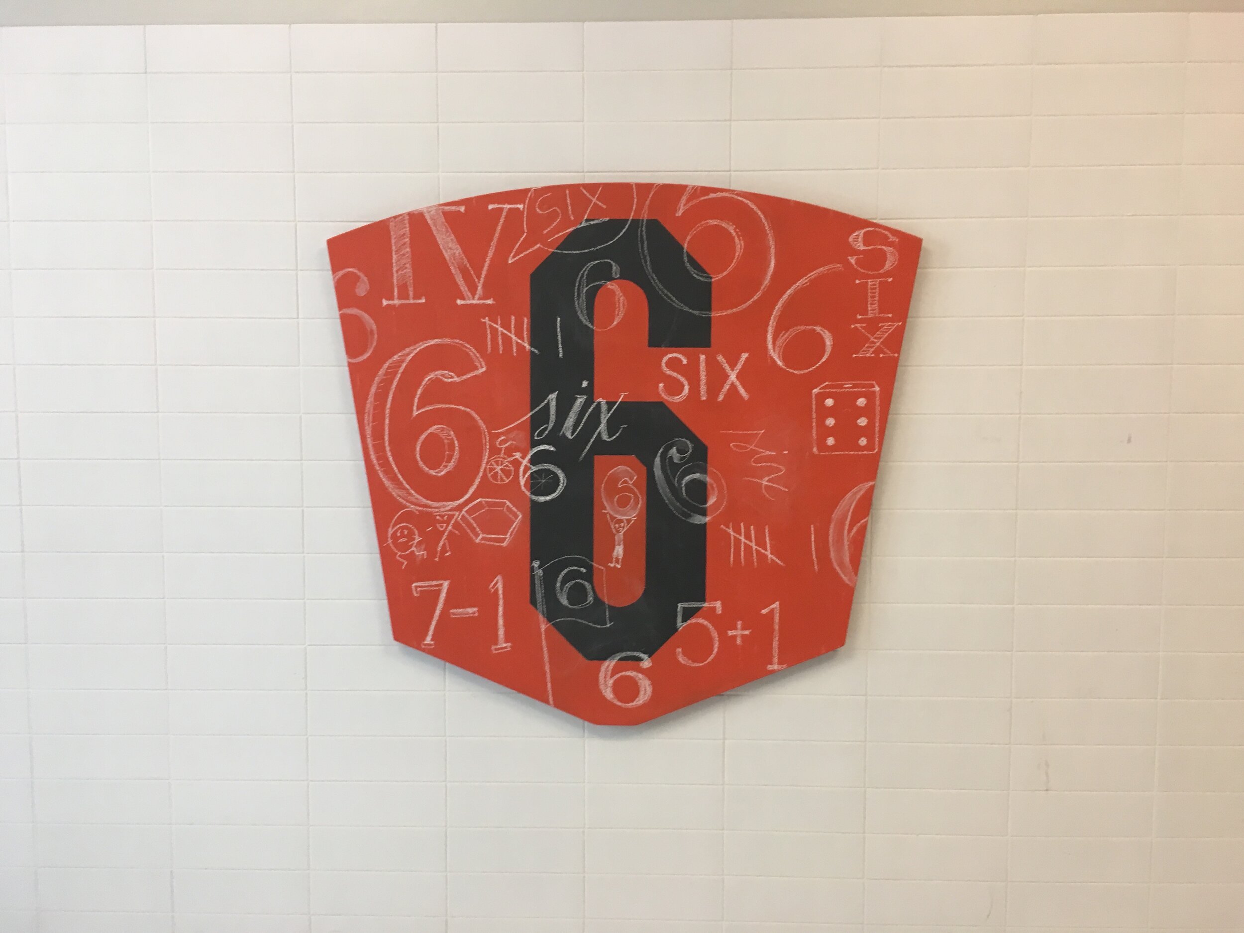
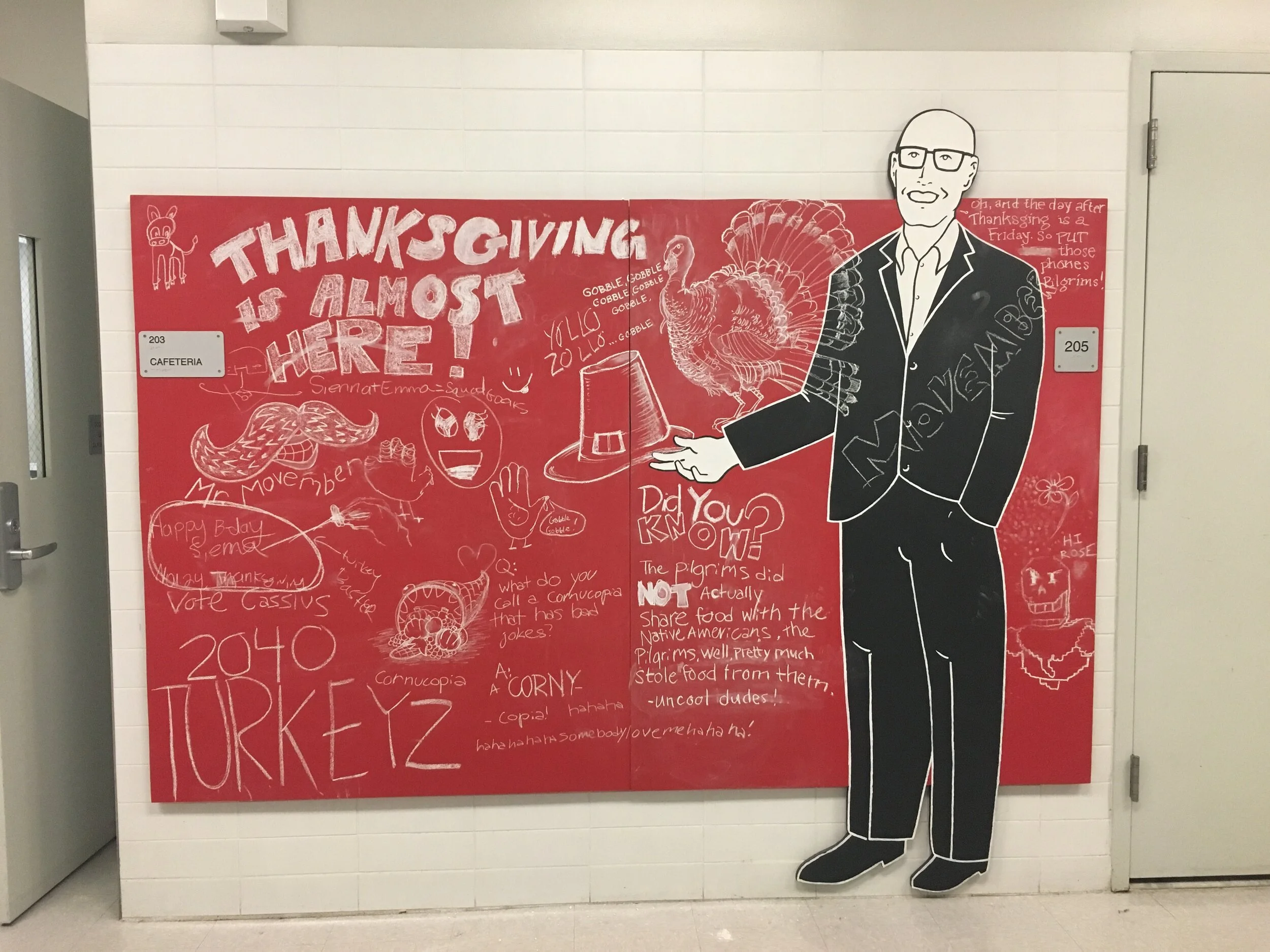
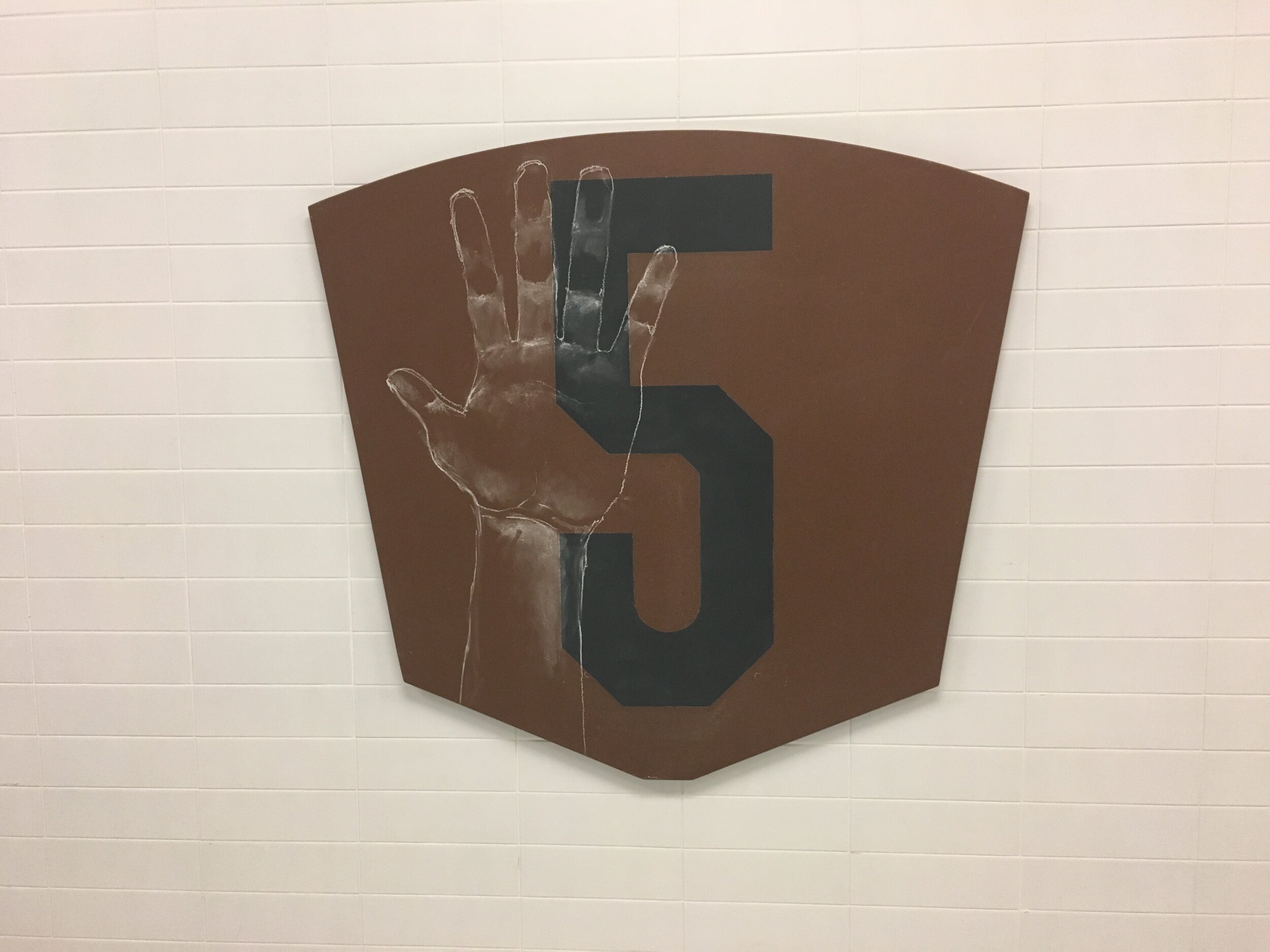
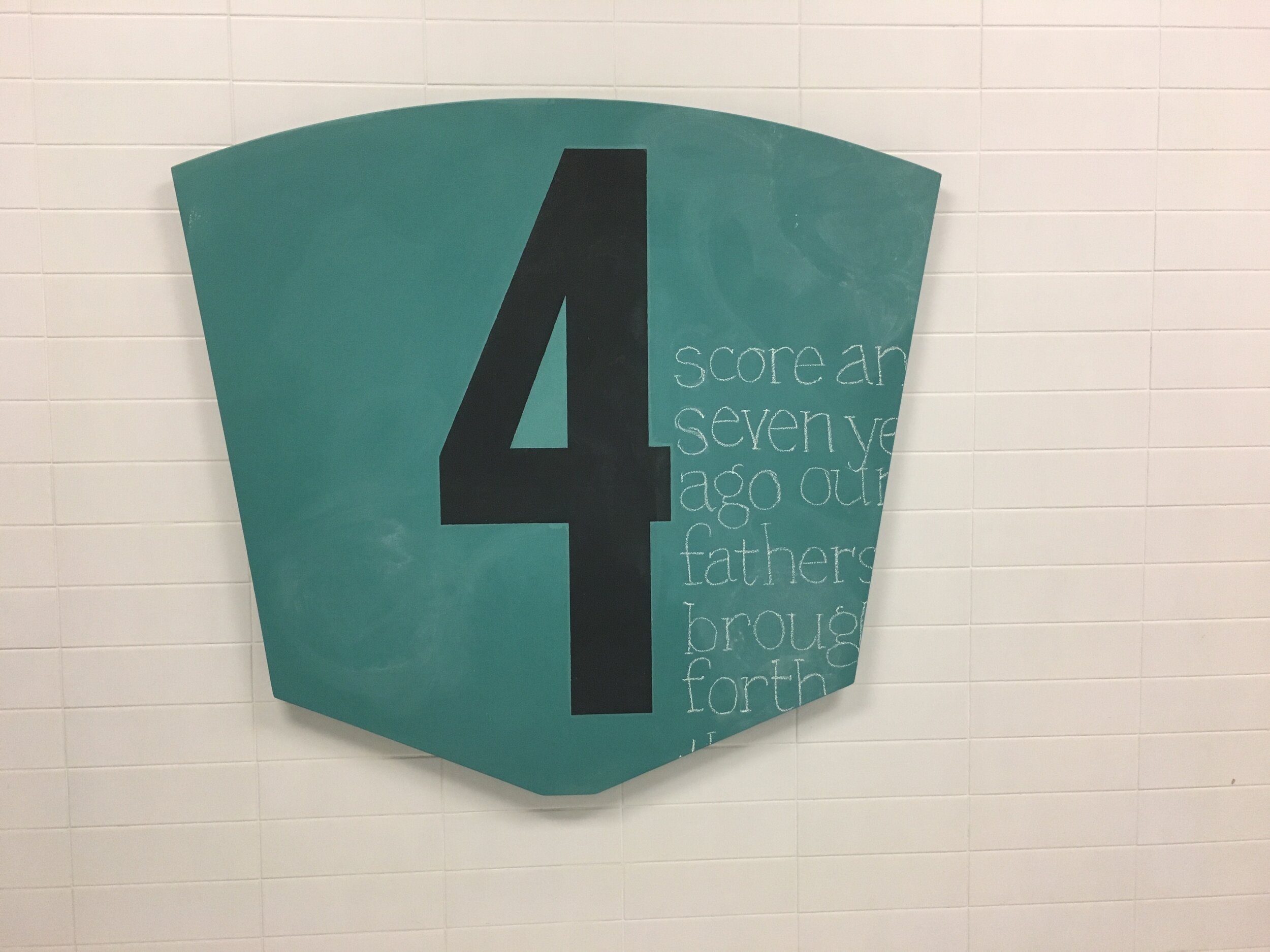
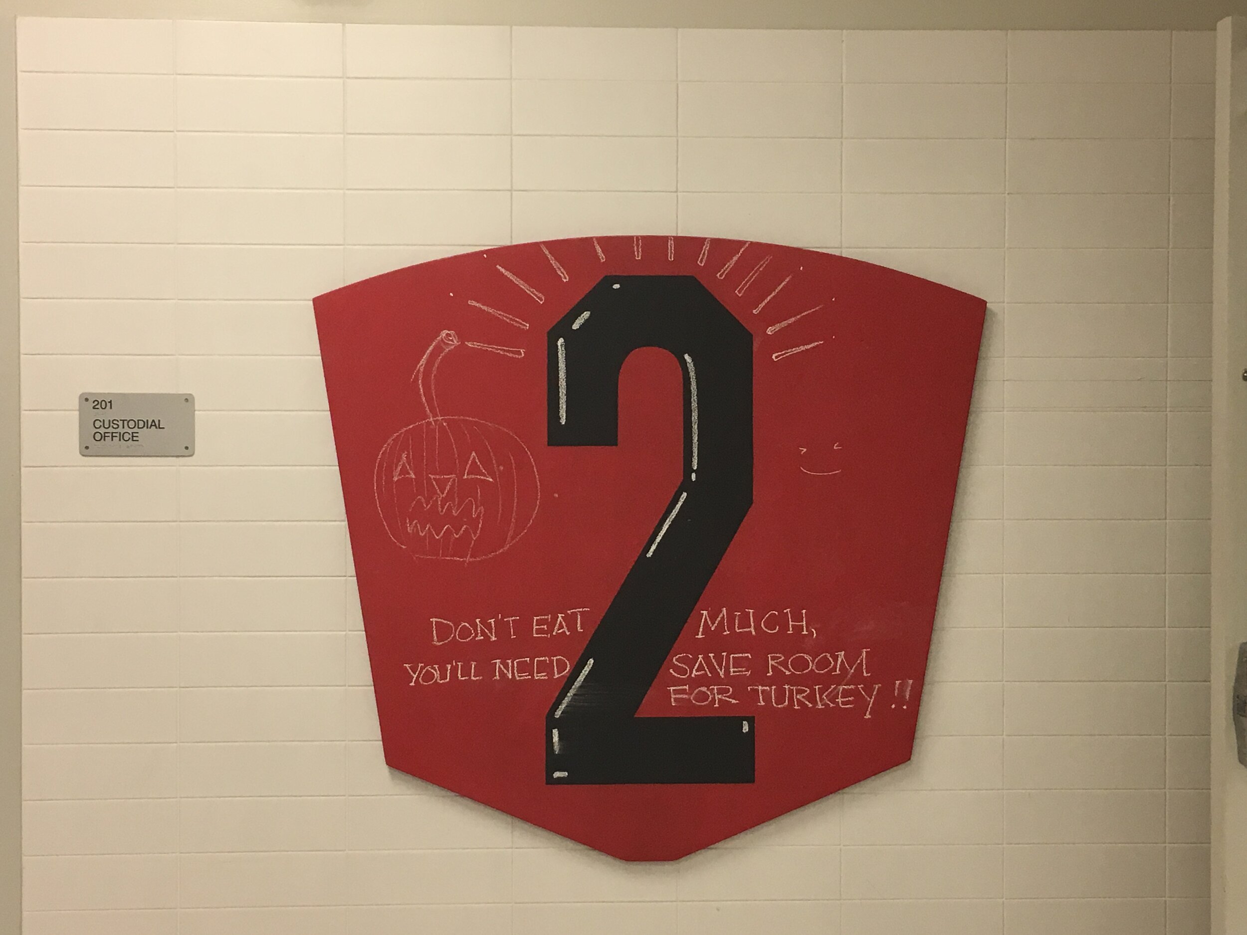
We achieved the first wayfinding goals with a riff on an iconic school component: low-tech, hand-made, communicatively colored chalkboards.
This system references the hand-drawn chalk mural the students had created with local artist Timothy Goodman on the approach to the original Clinton School building in Hell’s Kitchen. We also wanted a system to encourage students to easily add hand-drawn messages and original posters to advertise bake sales, clubs, sports events, fundraisers and more.
We identified the following specific signage needs:
Welcoming students each day in the foyer
Welcoming students to the cafeteria
Drawing attention to the LED displays in the cafeteria
Differentiating each floor with student-selected paint colors and a reminder of the school’s “Hawk Habits” and IB values like:
time management / responsibility / engagement / perseverance
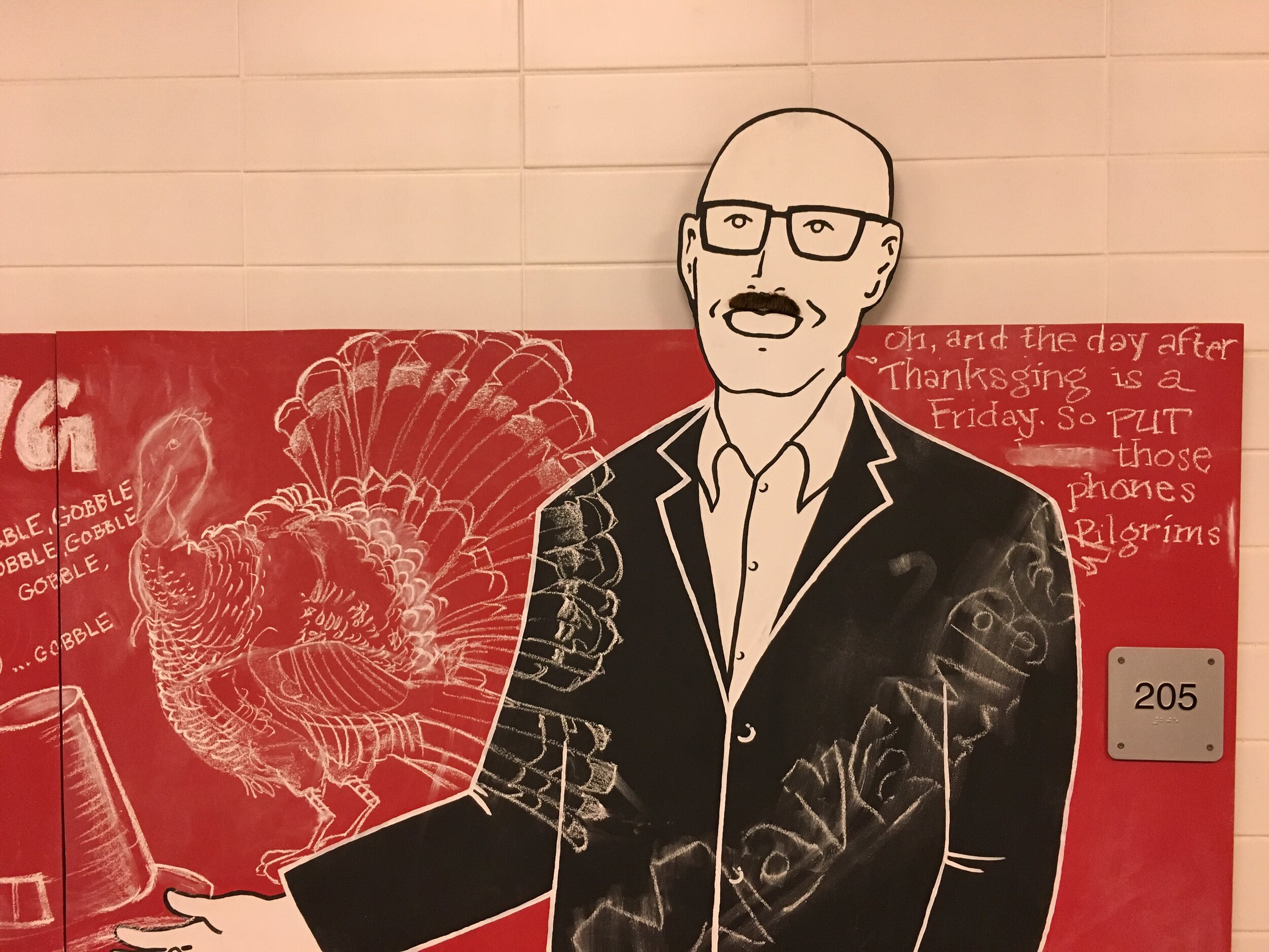
A way of differentiating each classroom—with a sign that indicates the classroom number, name and a fun bio of its teacher
A way of adding school spirit to the gym
A way to celebrate Clinton’s eighth floor, an open-plan freewheeling indoor-outdoor space meant for anything from theater rehearsal to Parent Association meetings. We suggested giving this amazing and versatile space its own name such as The Hawk’s Nest. And we envisioned two magnetic chalkboards between the elevators that emptied into the space used as a calendar of upcoming “Hawk’s Nest” events and a place for hand drawn messages and posters.
“The Clinton School signage helps me find my way—off the elevators, up the stairs, and down the hallways. I like reading the teachers bios while I wait outside class. These changes make navigating Clinton easier and more fun!”
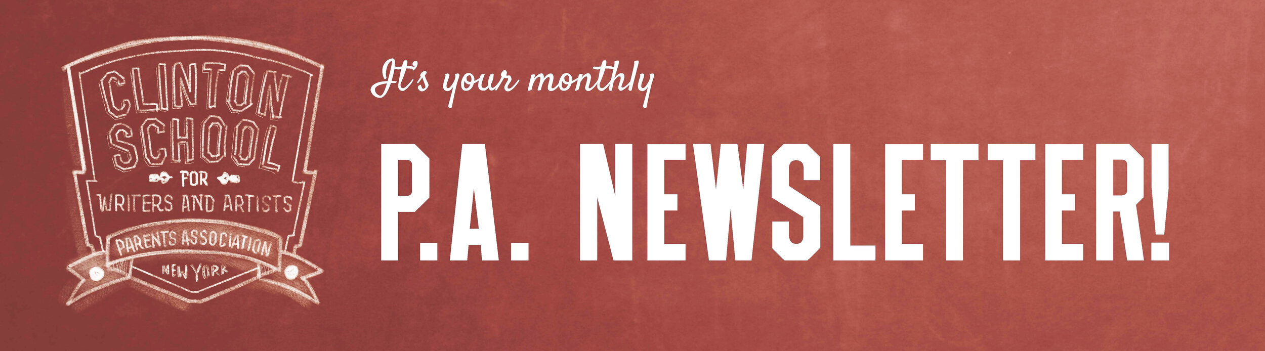
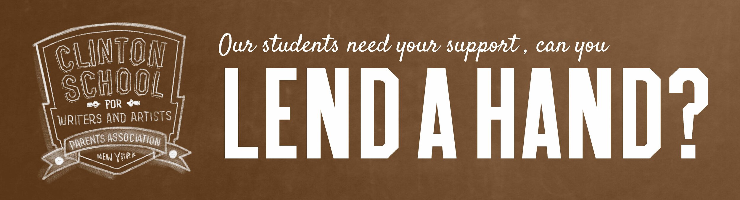
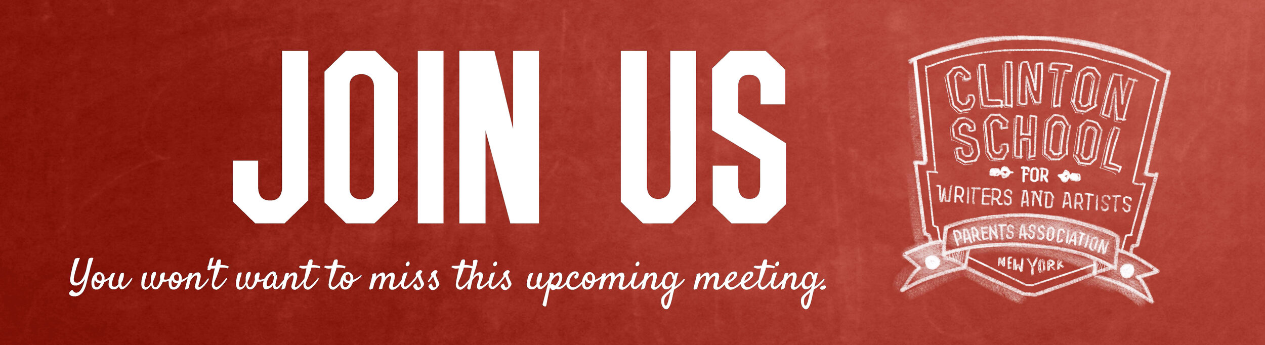
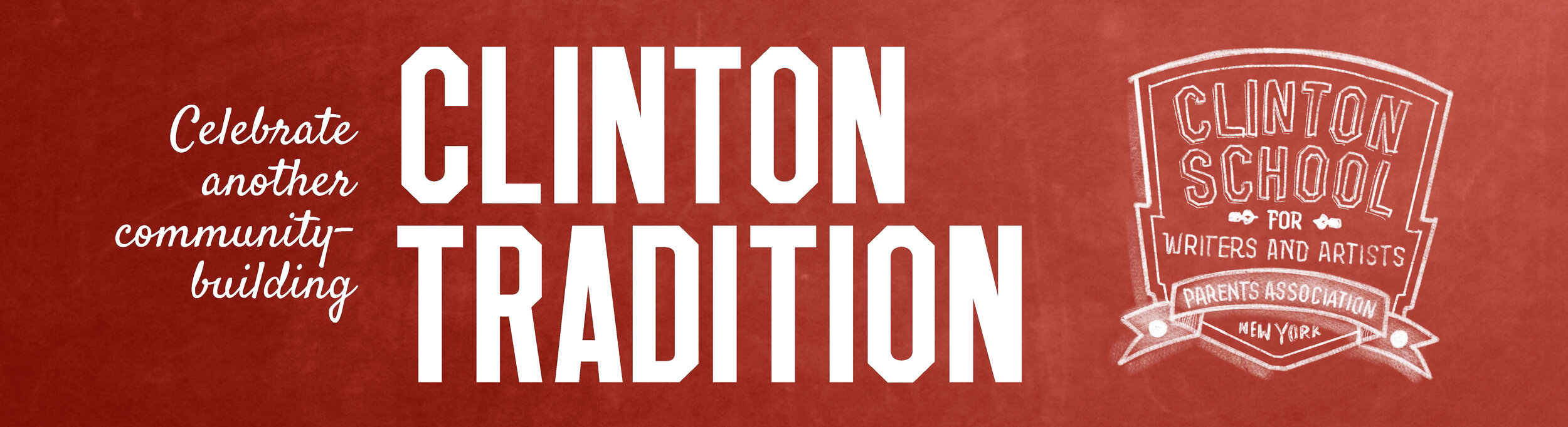
We also worked with the Clinton Parent Association to evaluate their e-newsletter communications to parents.
We performed a careful data analysis of several years’ of communications to determine which messages were being opened, read and interacted with and which news was being ignored.
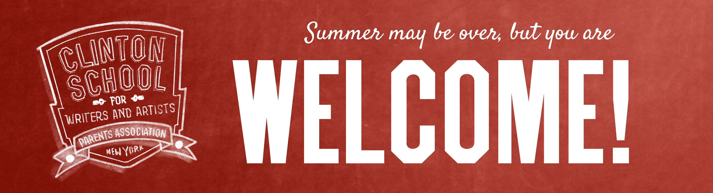
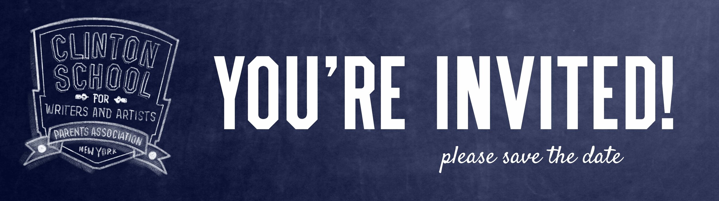
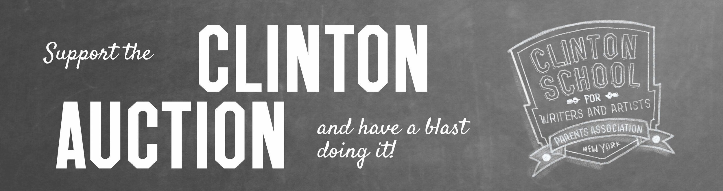
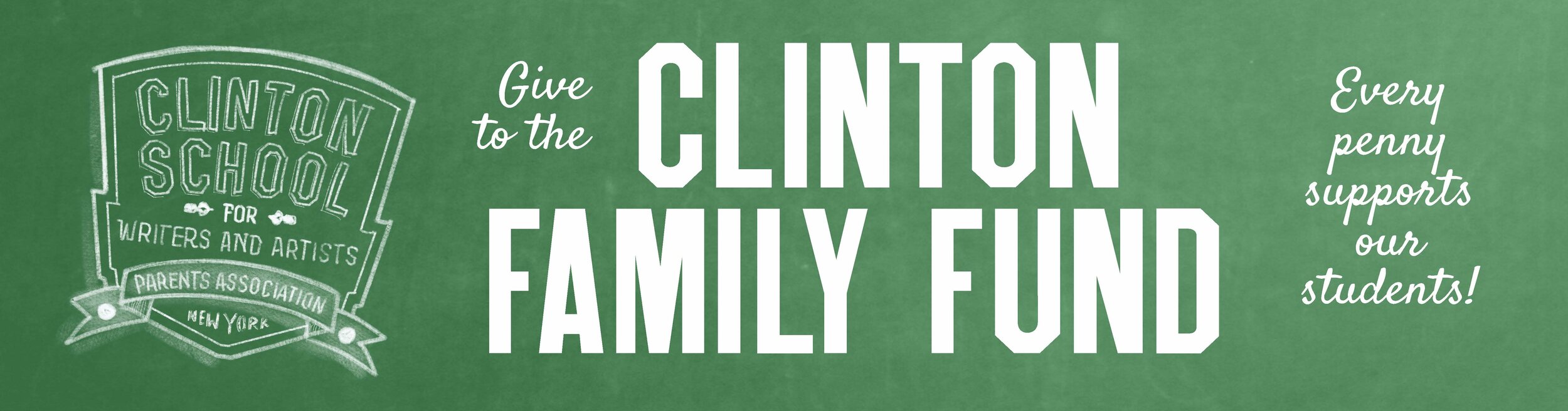
Then we created an editorial calendar of major milestones throughout the academic year to help focus communications and wrote sample copy and styleguides. We designed banners inspired by the wayfinding system to clearly indicate the subject of each mailing at first glance.
Strategically, the newsletter was designed to be:
1. a clear call to action
2. informative—sharing outcomes of events that rely on parent support
3. timely—with enough advanced notice to increase parental involvement
4. targeting middle school and high school parents separately with unique content relevant to them
5. visual banners supporting the Clinton branding and referencing the wayfinding system to quickly indicate the subject at hand
The new design gave the PA autonomy to create successful e-communications increasing open and click through rates.